Mirror of Galadriel Illustration
- Job: Freelance/Self-Driven
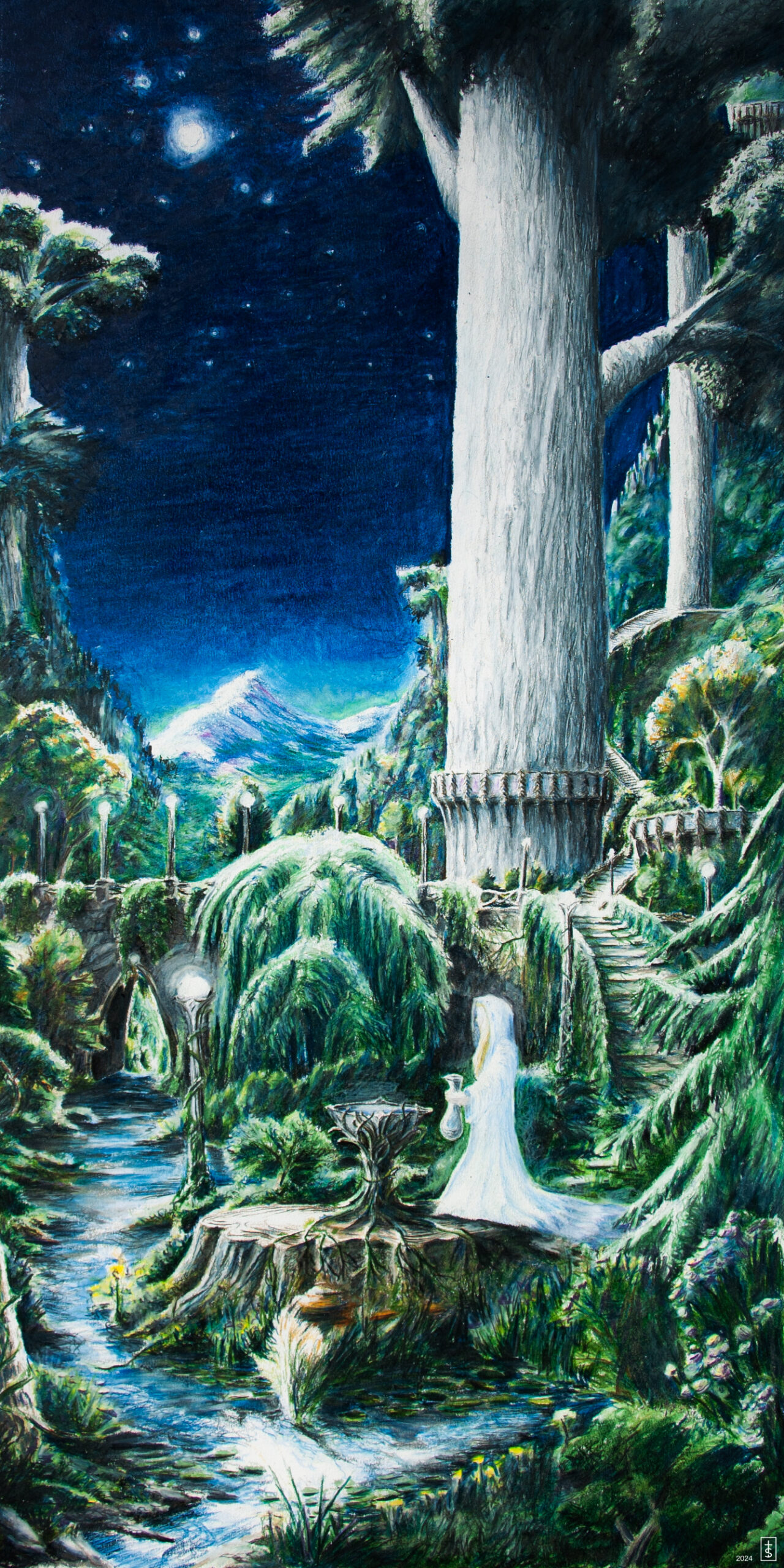
Process: This is one of the most in-depth illustration projects I have done to date. My goal was to create a completely original depiction from Lord of the Rings. Doing so required a lot of research, planning, sketching, patience and perseverance. The whole process took about a year – starting in early spring of 2023. I found the journey to be extremely rewarding – even if I may never be fully satisfied with the result. Below you can read about my creative process from beginning to end.
The natural place to start was studying the source material – The Fellowship of the Ring by J.R.R. Tolkien.
The Mirror of Galadriel is one of the most important chapters in the book series. It’s a pivotal moment in time for the fellowship’s journey, many of the characters being tested and the bigger picture of the story being developed. Along with that, the writing around the setting of Lothlorien is rich with detail (no surprise to anyone who has read enough Tolkien). The location is in the elven realm of Lothlorien near Caras Galadhon, or the City of Trees. The entire city is built elevated within the trees. The largest trees are the mallorn – towering trees with silvery-grey bark. The mirror of Galadriel is located on the south side of the city, near the outskirts, in a secluded area that has an opening to see the stars. A stream flows through the hollow, around the mirror which is described as a pedestal carved like a branching tree with a basin of silver resting on top. If you’re interested in knowing more about the setting and plot, I highly recommend reading the books if you haven’t (though, I’m not sure why you’re even here reading this if you haven’t). With all of this information in mind, I could begin to formulate in my head how this scene might look.
While I hold the LOTR film adaptations near and dear to my heart (The Extended Edition, Appendices, and Soundtrack were all watched/listened to during the course of creation), I didn’t want to rely on any specific visuals from the scenes to inform my creative. I did, however, take a lot of learning from the conceptual designs for the movies done by Alan Lee and John Howe – both of whose work I have a great appreciation for.
I wanted to create my own photo reference material for the natural scenery, so I took several pictures of the landscape around my home in Southern Wisconsin – along with a few architectural references from a visit to Chicago. Basically, anything that caught my eye as something I might want to include in the illustration I would capture and then incorporate into preliminary sketches. I really wanted the scenery to have an overgrown, ethereal feeling – like the very nature within the city is full of magic. I have to give a special shoutout to Saunder’s Creek, which I walked by every day when I took my kids to school. It was a major source of inspiration for the stream shown in the final illustration.
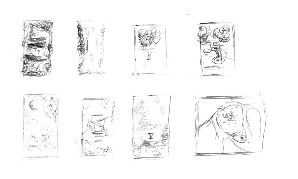
In order to get the setting right, I began with some quick thumbnail sketches to get a feel for mapping the environment and placement of elements. The sketches are messy and small, but extremely helpful to get the look right.
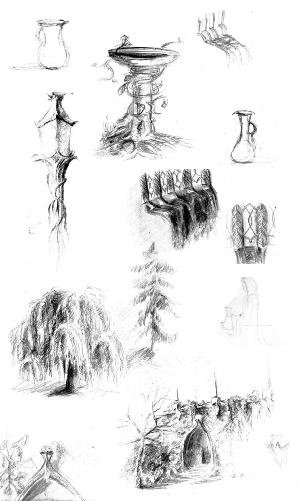
The next step was to start sketching different elements of the illustration – things that I knew would have feature focus and needed accurate detail. Along with that, I took a couple of the thumbnails from above and began some higher-quality sketch comps.
As I said above, I wanted everything to have a feeling of being overgrown – like nature was allowed to take over every space. Vines and leaves and trees were part of the structure of everything. The early sketch of the mirror captured some of what I was hoping for, but you’ll notice the end result is a bit more wild and tangled – I wanted it to look less like a bird bath and more like a carved pedestal.
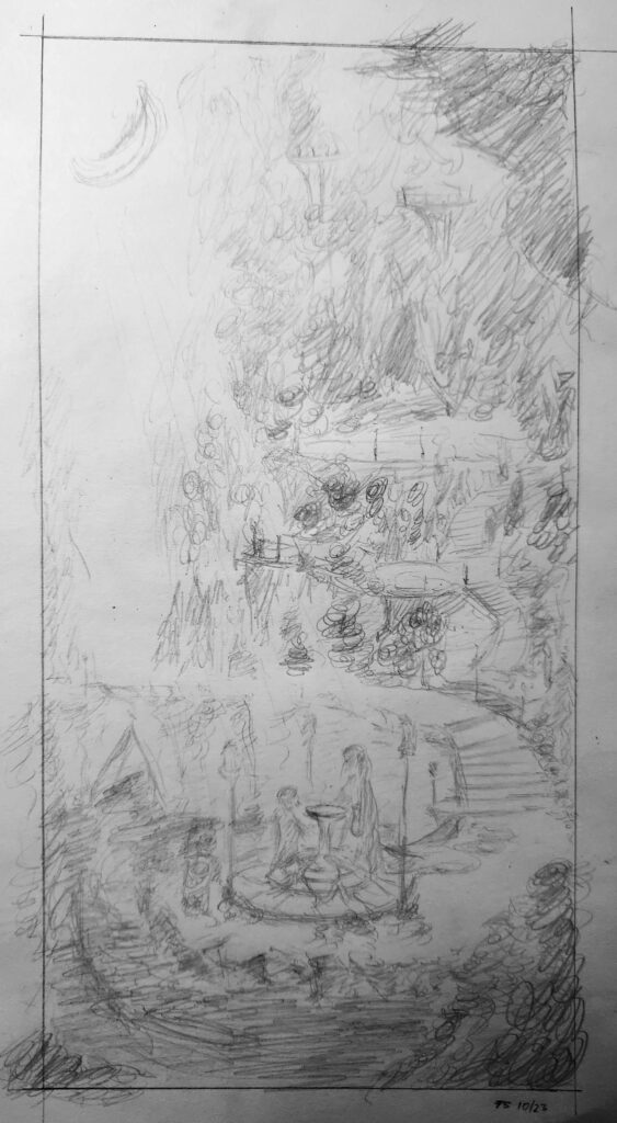
Getting closer! Now that I had done enough practice, I took everything I had done thus far and sketched my preferred composition.
I was able to begin mapping out where to place the trees and the elements of the city in the background. I imagined that there were several flights of stairs leading up into the city with many viewing platforms.
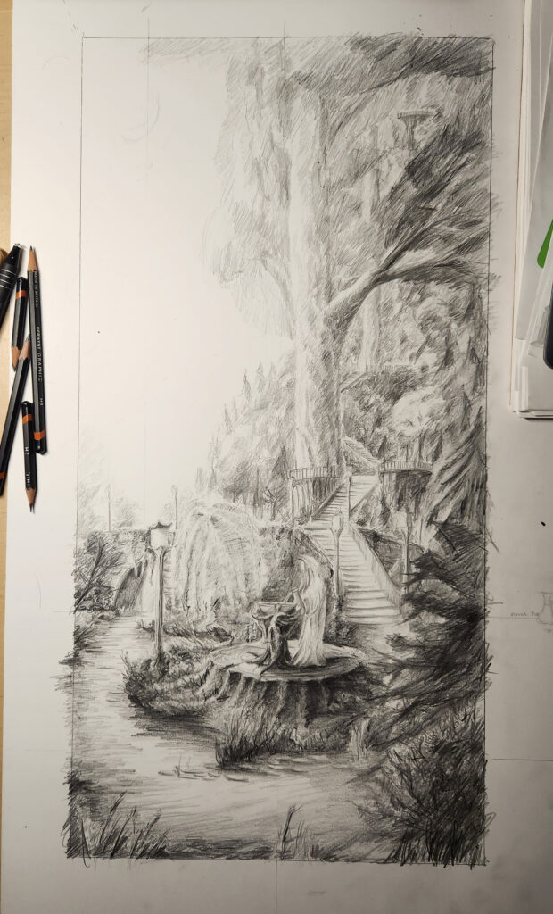
With the composition set, I created a refined version of the sketch in the final size dimensions (12×24″). This would give me not only a good practice run of drawing everything, but would also serve as a helpful reference for where to put things in the final version.
This was my first opportunity to sketch in some of the mallorn-trees. I wanted them to have prominence in the scene, especially since they are foundational to the city, but also because they really show the immense scale of everything.
I chose the setting to be in the late evening – where it’s dark enough to see the stars but light enough to still see some color. It was also a good opportunity to display the many lights that are described in the text throughout the scene.
Because willow trees already come with a magical aura about them, I wanted to incorporate one here even though it wasn’t specifically stated. The placement in the drawing is intentional, I liked the way the flowing branches lead right into the mirror – as if providing an extra dose of magic to the waters.
Now came the fun/scary part. I had done enough research and sketching and thinking and planning throughout the course of the year to get me to the point where I felt I was ready to create the final illustration (It’s a good thing I was doing this for myself and not under any budgetary or time constraints).
As with many of my other illustrations, I used Prismacolor Premier and Verithin colored pencils. The Verithins are for the detail and line work, the Premiers are for the impressionistic fills and blends. Together they give the illustration a vibrant, detailed, and layered finish. The paper I used is equally important – a 300lb hot-press illustration board, large enough to fit the final 12×24″ size. It receives the colored pencil lines very well, especially when blending colors and adding lighting. It also creates a nice, natural texture to the color and is sturdy enough to allow for erasing and layering.
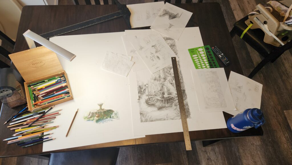
Over several months I chipped away at the illustration, almost like when you do a puzzle and it sits around on a table in your kitchen until someone finally puts it together. The image below shows my typical setup, surrounded by my sketches and pencils (this is why artists are messy people).
It’s extremely daunting to try to fill that amount of empty space with a finished illustration. To start, I chose the most important part of the scene – the mirror. I knew I only needed to get the initial layer and detail in at first. It was also important to establish where the light source was so I knew where to plan for lights and darks. Since this is a night scene I knew the light would be coming from the top left where I planned the moon and stars would be. There would also be a few localized lights from the fixtures, reflections, and from Galadriel herself.
With all of that in mind, you can see in the progression of images below how I went through the drawing. A lot of initial color placement to place each element in the space, and then revisiting later to add in the color and shading. The Prismacolor Premier pencils allow for beautiful blends to create variation and detail. There is even a “colorless blender” pencil that does not contain any hues but is meant simply to blend two existing colors together – a game-changer if there ever was one (I purchased three of them for this project and they are now extremely short).
Getting the final lighting and finish done was tricky. I wanted to find the right balance between the darkness of the scene while still showing the colors. The mallorn-trees are described as having silvery, shimmering bark so I knew those had to stay as light as possible – almost as if they were their own light source. With the amount of scenery shown, I had to make sure the things further in the distance, like the hills of trees and the mountains, were not as dark as the elements in the foreground.
As you can see from the images above, Galadriel was saved for last. Partly out of fear of getting her wrong, but also because I wanted the finish of the surroundings to determine how she looks. She should stand out enough where it feels as though she is a source of light herself. I had to find the right balance between adding just enough detail and color to make her look believable and in place within the scene, but not doing so much that she was over-detailed and over-done.
When I was satisfied with that aspect, there were a few more touch-ups that were added to achieve the final illustration, seen below.

This project was immensely fun for me. It was a continued learning experience for me in the process around illustration, and honing the skills needed to be successful. I also have a continued appreciation for the world that Tolkien created, which will always be one of my favorite places – whether reading the books, watching the movies, listening to the music, imagining scenes like this.
If you have read this far, bless you. I could go into more detail about this drawing, but for everyone’s sake I will not. Stay tuned for what’s next!